Courage Recreation Therapy Services
Role: UX/UI Designer
Duration: Aug 2024 - Dec 2024
Toolkit: Figma, Figjam
Overview
For this Designlab project, I partnered with Courage Recreation Therapy Services—a home and community-based business providing individualized therapeutic recreation services to individuals with developmental disabilities and other special needs. The goal was to redesign their website to create a more welcoming, user-centered experience that clearly highlights their services and better supports caregivers through an improved resource page.
Problem
The existing website averaged just eight visitors per month and failed to connect with users. Caregivers and families described it as “too hospital like” overwhelming, and hard to navigate—making it difficult to access helpful recreation therapy resources and information.
Client Goal:
To create a site that is warm, accessible, and easy to use, with resources and information that genuinely support families and caregivers.
Solution
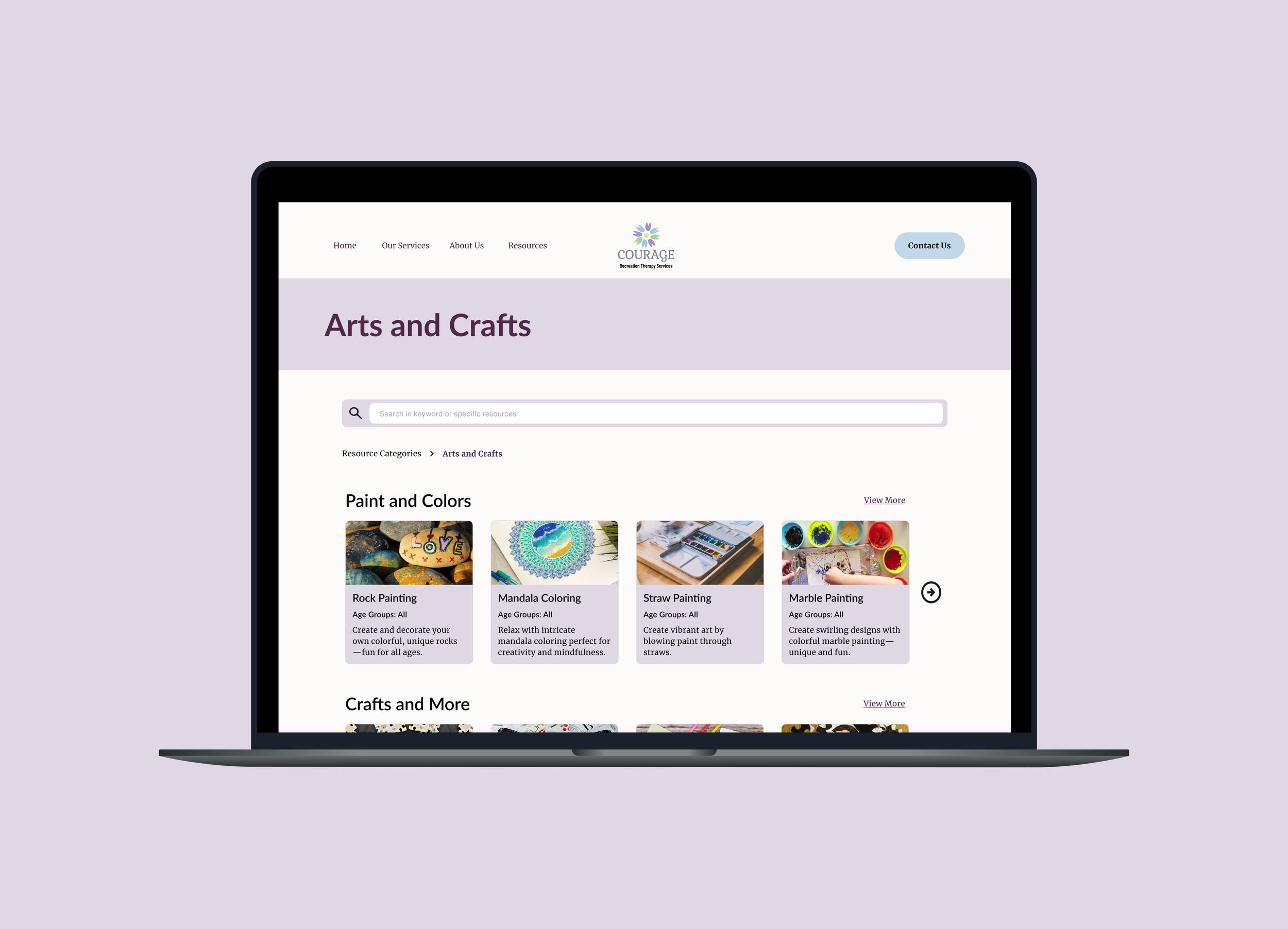
The redesign introduces a warmer, user-friendly interface, making it easier for potential clients to explore services. The revamped resource page is now better organized and visually engaging, helping caregivers quickly access helpful materials. These updates ensure a more inviting and accessible experience, improving engagement for both new and existing users.
Discover
Competitive Analysis
To gain a clear understanding of the problem and target audience—both current and future customers of Courage Recreation Therapy Services—I first needed to familiarize myself with the company, its services, and its existing customer base.
I researched businesses similar to Courage RT to conduct a competitive analysis. Finding direct competitors was difficult due to the niche nature of recreation therapy consulting, but I was able to find a few organizations offering overlapping services for comparison.
User Challenges/Pain Points
Businesses have unclear service locations
Users are low awareness of recreation therapy services
Websites are outdated
Lack of tailored resources for people with disabilities
What Competitors Are Doing Well
Photo galleries showcasing expertise and compassionate care
Displayed team bios with credentials to establish credibility
Resources with working links
Due to a lack of responses, I reached out to caregivers and professionals who work with individuals with disabilities, similar to the client’s target audience. I conducted five interviews to uncover their needs, preferences, and challenges when searching for recreation therapy services online.
Detailed service descriptions that clarify offerings
Define
User Personas
To better understand the target audience, I created two user personas:
Needs/Wants
More visuals, such as videos and photos to showcase services and activities
A website that feels friendly, compassionate, and welcoming
Easy-to-find contact information for quick support
Clear staff qualifications to build trust and credibility
POV and HMW
To address their challenges, this point of view and 'How Might We' question came to mind:
How might we provide clear, engaging, and accessible resources that help users understand the benefits of recreation therapy, incorporate therapeutic activities into daily routines, and easily connect with staff for personalized support?
Ideate
Feature Set
The must-have features for this project include a welcoming home page, a user-friendly resource page, a staff directory, and a clear breakdown of services. These priorities were identified through both user research and client discussions, ensuring they meet the core needs of the audience and stakeholders.
-
A visually engaging and user-friendly landing page that sets the tone for the website.
Why a priority?
It makes the site welcoming and intuitive for visitors, addressing both the client’s and users’ goal of enhancing the website’s user-friendliness
-
A curated collection of articles, videos, and images showcasing recreation therapy activities tailored to individuals with varying abilities.
Why a priority?
It provides accessible, practical tools for caregivers and families—meeting user needs for easy-to-use resources and fulfilling the client’s goal of creating a supportive resource hub.
-
A dedicated page with staff bios, qualifications, photos, and easy-to-access contact options (email, phone, or chat).
Why a priority?
It builds trust and transparency by showcasing staff expertise and makes it easy for users to connect with knowledgeable professionals—supporting both credibility and user engagement.
-
A description of companies services
Why a priority?
It fulfills users’ need for clarity around available services while supporting the client’s goal to promote and explain their offerings.
-
A section highlighting the company’s mission, vision, and values.
Why a priority?
It builds trust and reflects the empathy, professionalism, and credibility that users look for when choosing a care provider.
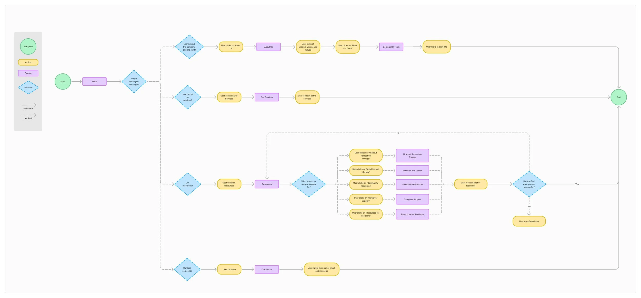
User Flow
With my feature set prioritized, I began crafting user flows to visualize how users would navigate the app. These flows informed the structure of my low-fidelity wire frames and ensured a user-centered design approach.
Design & Testing
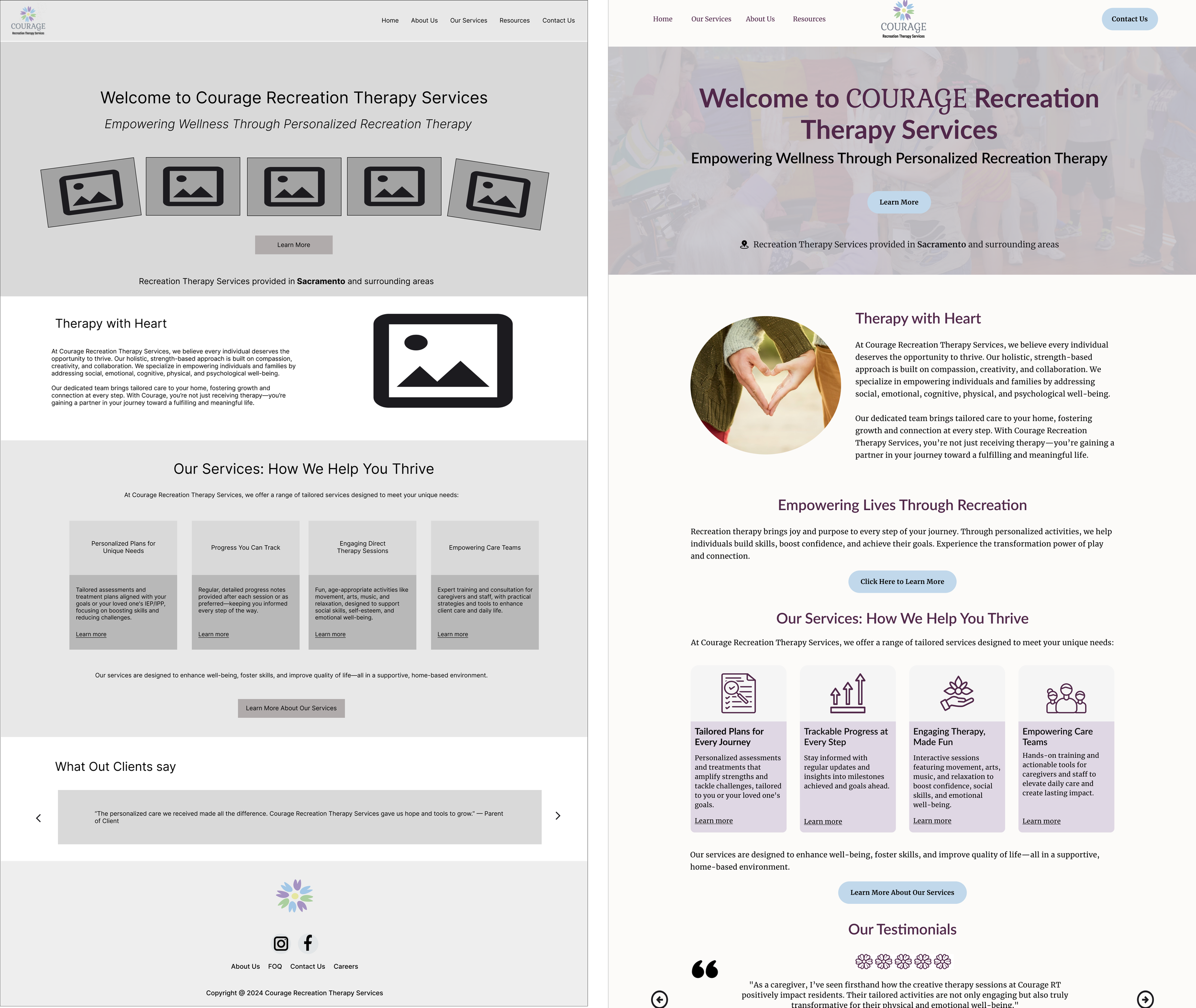
Low Fidelity Wireframes
I started by revisiting my user flows and exploring therapy and consulting websites for inspiration. I analyzed engaging layouts for service pages, “About Us” sections, and resource libraries to understand what works well. With those insights in mind, I sketched out low-fidelity wireframes to begin shaping the site’s structure.
Mid Fidelity Wireframes & Early Usability Testing
At the mid-fidelity stage, I refined the layout and structure to support user flows. My goal was to create simple, user-friendly navigation with clear, accessible content, while prioritizing organization to meet both user and client goals. I then ran early usability tests to evaluate how the design performed with tasks such as choosing a homepage preference, navigating through the site, finding company information, and locating an art-related resource. The feedback revealed a few usability concerns, which will help shape the high-fidelity wireframes.
Key Insights
All users successfully completed the tasks.
The first homepage design, out of 4 created, was preferred by most users for its simplicity.
Users suggested adding icons to improve navigation.
Typography adjustments were recommended to enhance the visual hierarchy.
A "What is Recreation Therapy?" section was proposed for clearer understanding.
Some users felt the resource page layout was too bland and recommended a more structured design.
Users expressed interest in a contact page or a Q&A section for easier access to support.
High Fidelity Wireframes
High-fidelity mockups were developed based on insights from low-fidelity user testing. Key improvements included incorporating more icons to reduce excessive text, enhancing navigation, minimizing blank spaces to create a more dynamic layout, and adding new pages that users requested, such as a "Contact" page and a "What is Recreation Therapy?" page. The color palette was inspired by the business's logo to maintain brand consistency. Mobile mock ups were also created.
User Research Journey
I originally planned to interview my client’s direct clientele to understand their needs and gather feedback on the website and resource page. For two weeks, I made multiple outreach attempts via phone—without any responses. Hoping a survey might be more accessible, I followed up with that approach. After another two weeks, I received just one response.
The Pivot
Key Insights
100% successfully located the resource page, with some suggesting filtering options.
Users found information about services easy to access, but some suggested more details and better title consistency.
The contact page was easy to navigate, but users suggested adding contact info to other parts of the site.
Most users appreciated the design’s simplicity, with positive feedback on accessibility and visuals. Mobile design was preferred over desktop.
Iteration
Based on user feedback, I simplified the homepage by reducing dense text, aligning buttons and images for consistency, and introducing dropdown menus for easier navigation. I adjusted layout spacing across pages, added community-focused imagery, and incorporated clear call-to-actions to improve readability and engagement. I also refined headings, shortened content, and used bullet points for easier skimming, creating a more welcoming and user-friendly experience overall.
Final Designs
Mobile
Desktop
Conclusion
Usability Testing
We conducted usability testing with 5 participants on both mobile and desktop versions, using the same task flows from our initial round—excluding the question about homepage preference.
Results
This case study highlights how the design balances client goals with user needs. The final design creates trust through clear organization, staff transparency, and a welcoming tone. Caregivers can easily find resources and information, making the platform more user-friendly and inviting. By aligning the design with both business objectives and user expectations, the site becomes a valuable and approachable tool for those who need it most.
Key Insights for Completing This Project
This project significantly contributed to my growth as a UX designer by improving my communication, adaptability, and problem-solving skills. I learned to collaborate with clients to align their goals with user needs, design responsive websites, and prioritize content for different devices. I faced challenges, such as difficulty reaching the target audience for user research and mastering responsive design in Figma, but overcame them by exploring alternative research methods and seeking mentorship. Key takeaways include the importance of balancing client objectives with user needs, clear communication, and effective prioritization. This experience reinforced my resilience, adaptability, and user-centered design approach, which I will apply to future projects.


