Audible App
Role: UX/UI Designer
Duration: Aug 2024 - Nov 2024
Toolkit: Figma, Figjam, Maze
Overview
As part of my UX Design studies with Designlab, I chose to improve the Audible app by designing a new feature to address content discovery challenges. The goal was to help users find audiobooks that match their interests faster and more effectively through a personalized onboarding quiz.
Problem
Audible users often struggle to find personalized audiobook recommendations—especially those who are short on time, have niche interests, or are new to the platform. The lack of tailored suggestions leads to frustration, overwhelming browsing experiences, and reduced engagement with the app.
Solution
I designed a quick and user-friendly onboarding quiz that gathers users’ preferences—genres, favorite authors, and topics of interest—to deliver relevant audiobook recommendations. Available during onboarding or through the Account section, this feature aims to reduce browsing time, increase satisfaction, and create a more engaging listening experience.
Discover
Product Audit
I began by exploring Audible to identify possible usability gaps. While the app has a massive audiobook library, the “Discover” section lacks essential filtering options such as author search, star ratings, or alphabetical sorting. This forces users to scroll through long lists, often leading to decision fatigue and frustration.
To better understand user needs, I conducted user interviews and a competitive analysis. These helped uncover pain points and explore how other platforms approach content discovery.
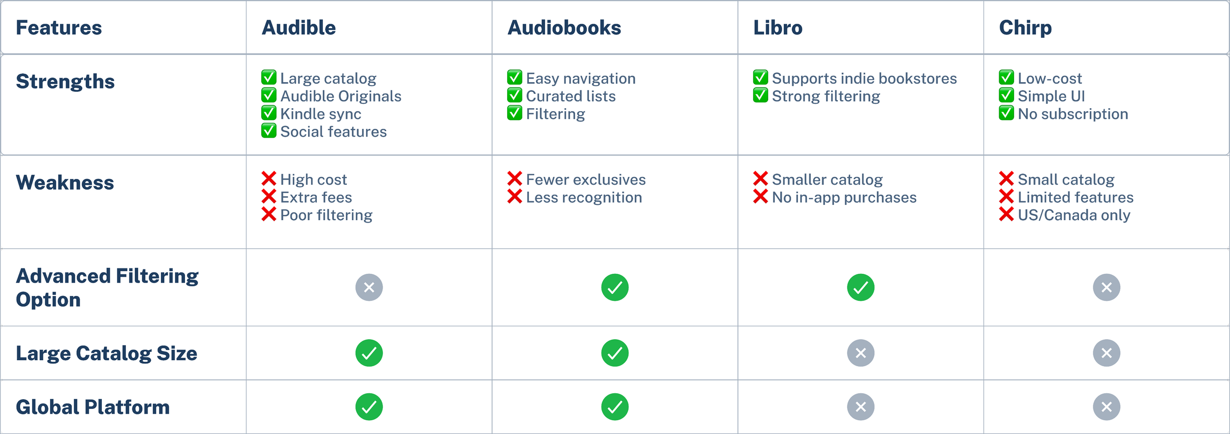
Competitive Analysis
I selected audiobook apps with similar core offerings to Audible and high user ratings to ensure a relevant and competitive comparison.


User Challenges/Pain Points
Users feel that recommendations lack personalization and often don’t reflect their interests.
The "Discover" section’s broad categories and absence of subcategories make browsing inefficient.
Without advanced filtering, users struggle to quickly find specific content.
Current Workarounds
Most users rely on the search bar instead of browsing due to its speed and clarity.
Some turn to alternative platforms like Libby for better discovery tools and access to content.
Affinity Map
We conducted interviews with five users, aged 28-40, including three regular audiobook listeners. This qualitative research helped uncover valuable insights about user behaviors, preferences, and pain points in the discovery process.
User Personas
To better understand the target audience, I created two user personas:
What Users want
Smarter recommendations based on listening history and preferences.
Robust filters (i.e subcategories, ratings, availability, and academic content)
A clearly labeled section for free audiobooks.
Social integration with platforms like Goodreads for trusted peer recommendations.
Faster, smarter search for easier content discovery
To make sense of the qualitative data from our user interviews, we used an affinity map to group user statements into recurring themes. This helped identify key frustrations, behaviors, and desires related to the audiobook discovery experience.
Define
POV and HMW
To address their challenges, the guiding question becomes:
How might we build a recommendation system that learns what users like to read so that they get a more personalized experiences that allows them to discover new authors and stories without feeling overwhelmed?
Ideate
Feature Set
While exploring feature ideas, one stood out—a personalized recommendation quiz. Inspired by onboarding quizzes in other apps, I saw an opportunity to adapt this for Audible to streamline book discovery and deliver tailored audiobook suggestions based on user preferences.
-
A short quiz that captures user interests to customize content on the Home and Discovery pages for a more relevant experience.
Why a priority?
By quickly tailoring their experience, users are more likely to find content they enjoy, which increases engagement, satisfaction, and retention.
Main Priority
-
Allows users to quickly narrow down search results based on multiple criteria.
Why a low priority?
Users currently show more interest in personalization and customization features than advanced filtering. Enhancing filters offers value but doesn’t address the most immediate user needs.
Low Priority
User Flow
With my feature set prioritized, I began crafting user flows to visualize how users would navigate the app. These flows informed the structure of my low-fidelity wire frames and ensured a user-centered design approach.

Design & Testing
Low Fidelity Wireframes
Once the user flows were set, I created low-fidelity wireframes to visualize the layout and overall experience. After a few rounds of iteration to refine the design and ensure consistency with Audible’s existing patterns, I moved on to creating mid-fidelity wireframes for more detailed structure and interaction.
Early Usability Testing
The main goal of this early testing session was to uncover any pain points in the quiz's design and user flow. We wanted to ensure that users could easily access, complete, and understand the quiz experience.
Participants
5 existing Audible users
Moderated sessions
Conducted remotely

Task 1
User takes the Recommendation Quiz to get better audiobook suggestions.
Task 2
User wants to retake the quiz but must find it again without the homepage ad.
Key Insights
All 5 users completed tasks successfully and rated navigation 5/5 for ease.
Most users instinctively went to the Profile section to reaccess the quiz.
3 out of 5 selected more than three genres, despite being instructed to choose up to three—indicating a need for clearer UI guidance.
Feedback on the “Add Favorite Books” section was mixed—users felt it lacked flexibility and raised questions about how recommendations were generated.
Most users liked adding favorite authors, though some suggested limiting how many could be added.
One user recommended adding a number scale to the sliding preference bar for clarity.
A minor issue was noted where items displayed unexpectedly when clicked.
High Fidelity Wireframes
After testing the low-fidelity version, I made updates based on user feedback. I redesigned the "Favorite Book" section to be more like the "Favorite Author" section, which users found easier to use. I added icons for clarity and adjusted the spacing and layout to improve readability. I then created high-fidelity wireframes using Audible's color scheme and design style to keep everything consistent and familiar. Additionally, I fixed the prototype functionality to reduce completion time.

User Interviews
The goal of this research was to understand how users interact with Audible's "Discover" section, identify opportunities for improvement, and explore how they discover new books.
Methodology
Key Insights
All users found the quiz easy to use and felt the time allotted (average: 5 minutes) was sufficient.
Users liked the visuals and colors, but identified some typos.
One user struggled to locate the "Next" button.
Users were frustrated by the inability to manually input authors and books due to a testing oversight.
All users successfully found an alternative way to access the quiz.
Iteration
While users responded positively during testing, I saw opportunities to fine-tune the experience further. The images below highlight these key design improvements.
Final Designs

Conclusion
Usability Testing
We conducted usability testing with 5 participants on both mobile and desktop versions, using the same task flows from our initial round.
Results
“This was way easier than the last time I tested it. Definitely a better flow.” — User from usability test
The redesign of the Audible app, specifically the introduction of a personalized audiobook recommendation quiz, effectively addressed users' need for more tailored content discovery. User testing revealed that the feature was well-received, with most users finding it easy to navigate and helpful in discovering new books. The design also adhered to Audible's existing visual style, ensuring seamless integration with the app’s current user interface.
Additionally, follow-up user testing showed a significant improvement in completion time, with the average time to complete the quiz reducing to 125 seconds (around 2 minutes), a decrease of 3 minutes. This reduction in time not only enhances user engagement but also benefits busy users by making the quiz quicker and more convenient to use.
Key Insights for Completing This Project
This project has been an invaluable learning experience that helped me grow as a UX designer, particularly in flexibility, user-centered design, and simplifying complex concepts. I enjoyed designing a feature for an existing app, balancing the integration of Audible's design elements with user needs for personalization. While the process was challenging—especially in narrowing the focus to personalization and adjusting designs based on feedback—it taught me the importance of listening to users and iterating quickly. Despite difficulties in recruiting participants and time constraints, I learned the significance of adapting my approach, which will guide my future projects in creating more user-focused, effective designs.